15 Winter Wedding Color Schemes (That Don’t Look Like Christmas)
15 Winter Wedding Color Schemes (That Don’t Look Like Christmas)
When I first stepped into a winter wedding venue draped in stark white linens, I knew the color palette had to dodge the inevitable holiday clichés.
Finding a scheme that feels frosty yet fresh without slipping into Christmas red and green can feel like hunting for a snowflake that won’t melt.
In this list, I’ve gathered fifteen curated color combinations, from emerald‑black‑gold to caramel‑toffee‑vanilla, each paired with lighting, fabric, and budget tips that keep the look sophisticated and seasonally appropriate.
1. Emerald, Black, and Gold
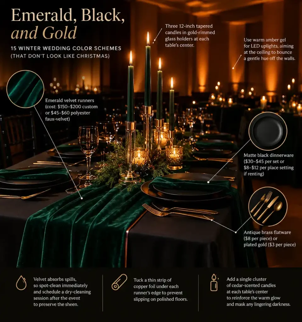
Emerald velvet runners stretch across matte black dinner plates, while antique gold flatware catches the dim light.
The deep black surface soaks up most of the ambient glow, so the venue needs warm uplighting or a row of tall candles to keep the room from feeling cavernous.
Start by positioning three 12‑inch tapered candles in gold‑rimmed glass holders at each table’s center; the flame adds height and softens the darkness.
Choose a warm amber gel for any LED uplights, aiming them at the ceiling to bounce a gentle hue off the walls.
For a high‑end look, order custom‑woven emerald velvet runners at $150‑$200 each; a budget‑friendly alternative is polyester faux‑velvet at $45‑$60, which still drapes nicely but resists stains.
Matte black dinnerware runs $30‑$45 per set; if you need to rent, expect $8‑$12 per place setting.
Antique brass flatware costs about $8 per piece, while plated gold is $3 and still provides the same metallic pop.
Velvet absorbs spills, so spot‑clean immediately and schedule a dry‑cleaning session after the event to preserve the sheen.
A quick tip: tuck a thin strip of copper foil under each runner’s edge to prevent slipping on polished floors.
Add a single cluster of cedar‑scented candles at each table’s center to reinforce the warm glow and mask any lingering darkness.
2. Dusty Blue, Slate Grey, and Silver

A sunrise‑lit chapel with frost‑kissed windows sets the stage for a dusty blue, slate grey, and silver palette.
The cool tones echo the early‑morning sky and give the ceremony an airy, wintry feel.
Dusty‑blue chiffon bridesmaid gowns pair with slate‑grey tuxedo jackets, while silver chargers sit on crisp white linens.
In natural light, the colors shimmer, but under typical yellow reception bulbs they can appear flat.
Offset the washout by adding reflective elements, mirrored vases, a silver sequin runner, or brushed‑metal candle holders to bounce light back onto the tables.
Quick tip: line the buffet table with a thin sheet of silver acrylic; it catches ambient light without overwhelming the palette.
Keep the overall look cohesive by limiting additional hues; let the three shades and white dominate.
This approach works best for outdoor or glass‑walled venues where daylight persists into the early reception.
Place a silver leaf garland along the head table to keep the light reflecting throughout the evening.
3. Plum, Fig, and Sage Green
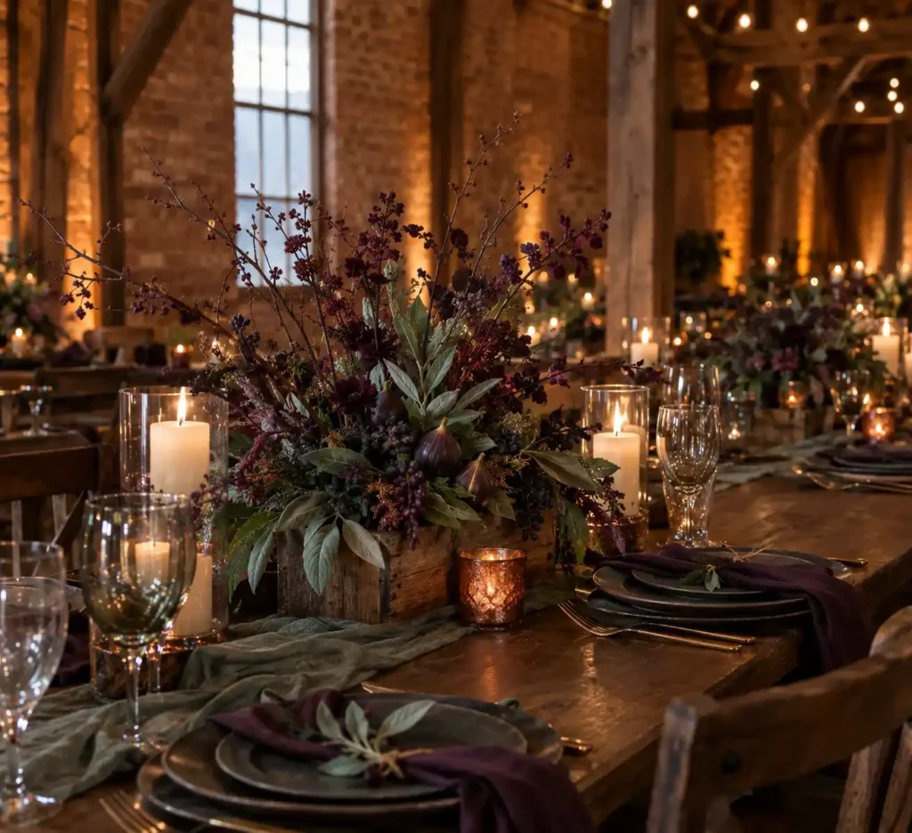
A reclaimed‑brick barn with exposed timber beams lets the plum, fig, and sage palette breathe.
The deep plum of dried branches pairs with the earthy fig of muted berries and the soft sage of fresh foliage, echoing the venue’s historic texture.
For a budget‑friendly centerpiece, buy a bundle of dried plum twigs for $12‑$18 and a bunch of sage leaves for $6‑$9, then tie them together with jute twine and set the bundle in a low wooden crate.
The crate adds height without crowding the table and keeps the arrangement stable on uneven barn floors.
A quick tip: spray a light mist of water on the sage leaves just before the ceremony; the subtle sheen catches the low lighting and prevents the greens from looking wilted.
If you prefer fresh figs, expect to spend $25‑$35 per pound, but faux figs from a décor shop cost $8‑$12 per pack and look just as lush.
Be aware that very dark purple flowers can photograph as flat, featureless black shapes if the venue lacks high‑quality spotlighting; supplement them with a few ivory candles to lift the contrast.
Add a single copper candle holder to each crate for a warm glow that offsets any dark flower shadows.
4. Navy Blue, Copper, and Cream
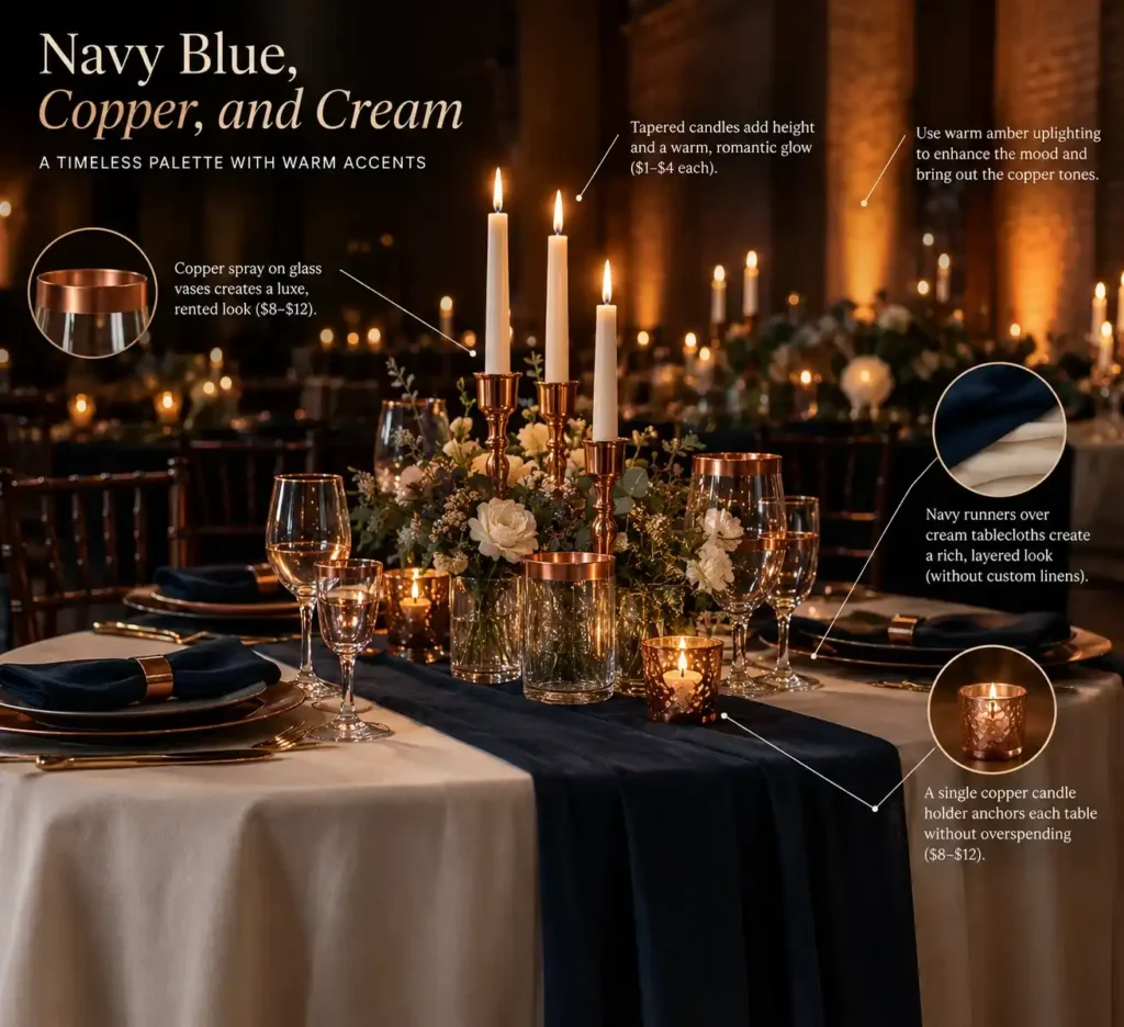
Spray‑paint the rims of clear glass vases with copper metallic spray paint to mimic rented copper pieces.
Navy works as a sturdy anchor, pulling the room together while copper adds a warm, reflective accent.
Soft cream textiles, think linen tablecloths or chiffon drapes, balance the depth of navy and keep the palette from feeling heavy.
A full‑size copper candelabra can run $150‑$250 per piece, quickly inflating the decor budget.
Instead, purchase a 12‑oz can of copper spray for $8‑$12 and coat the edges of inexpensive glass vases you already have. Test the paint on a scrap piece first to avoid drips.
If the metallic finish feels too industrial, swap the copper for brushed bronze spray, which costs the same but offers a subtler tone.
Pair the vases with navy table runners laid over cream tablecloths for a layered look that requires no custom linens.
Quick tip: place a single copper‑coated candle holder on each table to anchor the palette without overwhelming the budget. Add a navy napkin ring to each place setting for a cohesive pop of color.
5. Burgundy, Blush, and Dusty Rose

Achieving a traditional blush floral look in the winter comes with a steep price hike due to imported flower costs.
The burgundy‑blush‑dusty rose palette still feels romantic, but fresh blush roses can add $30‑$50 per stem.
A budget‑friendly route swaps the pricey roses for deep burgundy carnations, which run about $2 each at wholesale markets.
Pair the carnations with spray‑painted dried wheat or statice in dusty rose; a light coat of matte rose pigment gives the same soft hue without the florist markup.
For table décor, drape dusty rose chiffon runners across the banquet tables. The fabric catches candlelight and costs roughly $12 per yard, a fraction of the floral expense.
If you prefer a printed element, Zazzle offers Dusty Rose Blush Floral Wedding Invitations at $1.90, $2.97 per card, keeping the color story consistent from the paper to the petals.
Couples who still want a live bouquet can opt for an Etsy‑sourced Blush Tiger Lily & Rose arrangement, starting at $16, and supplement it with burgundy carnations to stretch the centerpiece.
A common mistake is over‑layering dried elements, which can look cluttered. Keep the spray‑painted pieces to three stems per vase for balance.
Add a few sprigs of rosemary to the burgundy carnation centerpieces for a fragrant, green contrast that stays within a $50 floral budget.
6. Olive Green, Terracotta, and Taupe
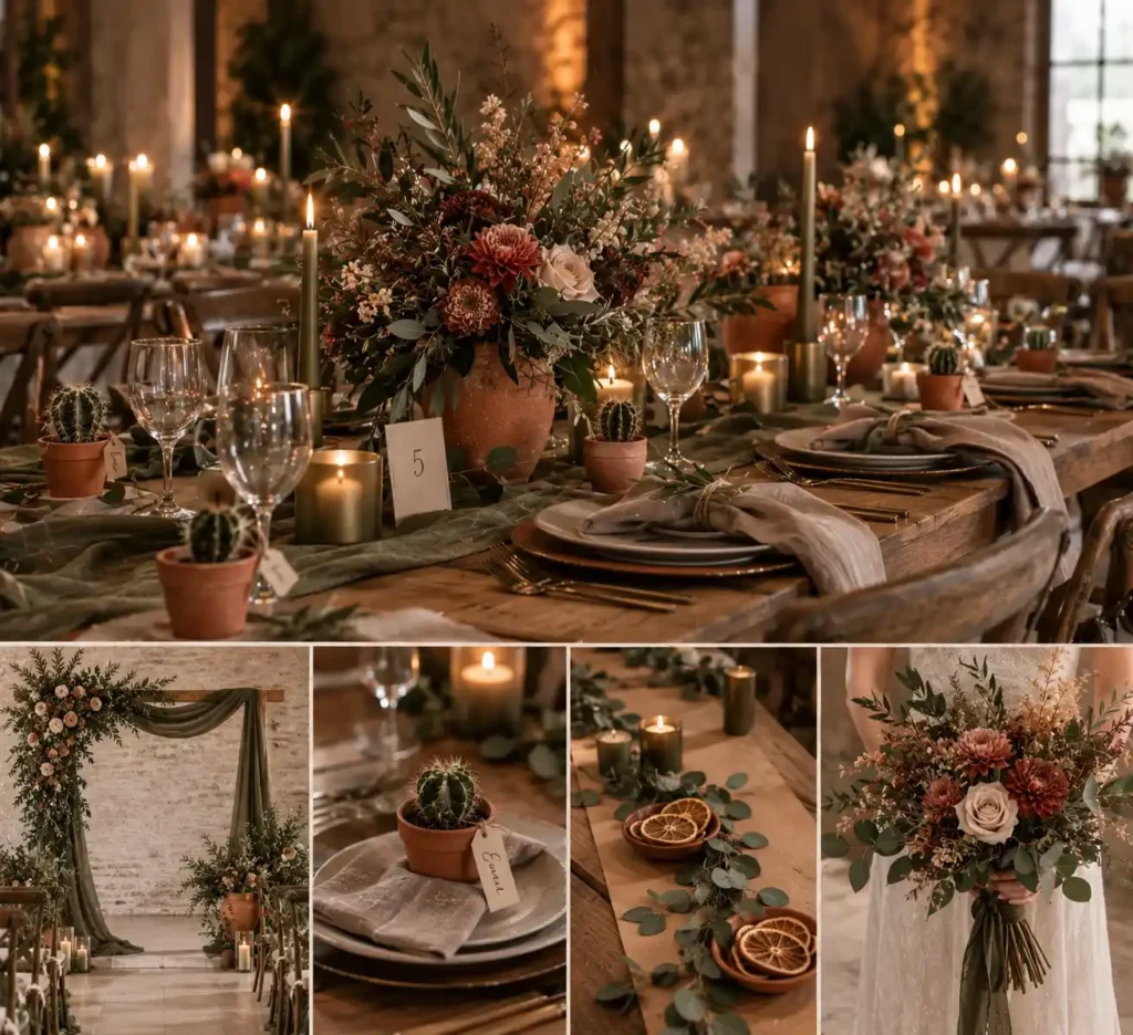
A deep olive backdrop paired with terracotta clay pots and soft taupe linen napkins creates an earthy, transitional feel.
The olive anchors the space, while terracotta adds a sun‑warmed glow and taupe softens the overall tone.
Choose matte finishes for every element; a brushed‑metal olive candle holder, unglazed terracotta planters, and hand‑loomed taupe napkins keep the palette grounded.
Avoid shiny polyester in these colors; flash lighting will catch the gloss and make the setup look cheap.
Quick tip: line the reception tables with a single sheet of kraft paper, then scatter olive‑green eucalyptus sprigs and place terracotta bowls of dried citrus slices on top; the paper adds texture and stays within the color story.
For the ceremony, drape a thin olive‑green muslin veil over the arch instead of a satin one; the matte fabric blends with the background and reduces glare.
Add a small olive‑green cactus in a terracotta pot at each guest’s place setting; it reinforces the palette and doubles as a reusable favor.
Place a single olive‑green eucalyptus garland behind the ceremony arch to pull the palette together without extra cost.
7. Charcoal, Pewter, and Crisp White
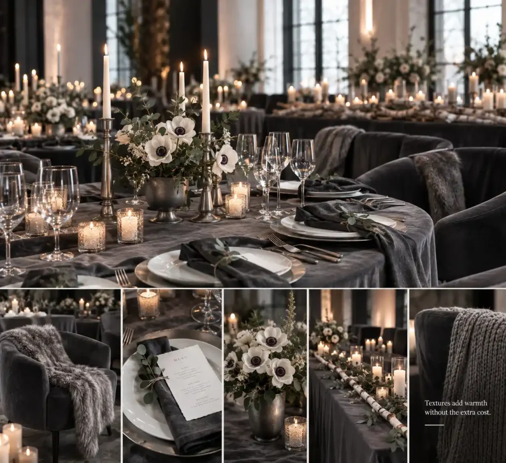
A charcoal velvet lounge chair anchors the reception tables, setting a sleek backdrop for the color trio. Pair it with pewter candlesticks and crisp white plate chargers for a clean, modern feel.
The palette cuts floral spend dramatically; a handful of white anemones in a matte pewter vase supplies the only blooms needed.
Without tactile accents, the room can feel like a corporate meeting. Add chunky knit wraps for the bridal party and textured cotton paper menu cards to introduce warmth.
A quick tip: drape a single silver‑gray faux fur throw over the lounge chair; it costs under $30 and instantly softens the look.
For a budget‑friendly version, swap pewter chargers for brushed aluminum ones found in most home‑goods stores for $2‑$4 each.
The trade‑off is clear: you save on flowers but must source high‑quality textures to avoid sterility.
Finish the scene with a narrow birch branch runner across the head table; the natural wood adds organic contrast without breaking the minimalist vibe.
8. Mustard Yellow, Forest Green, and Tweed Brown
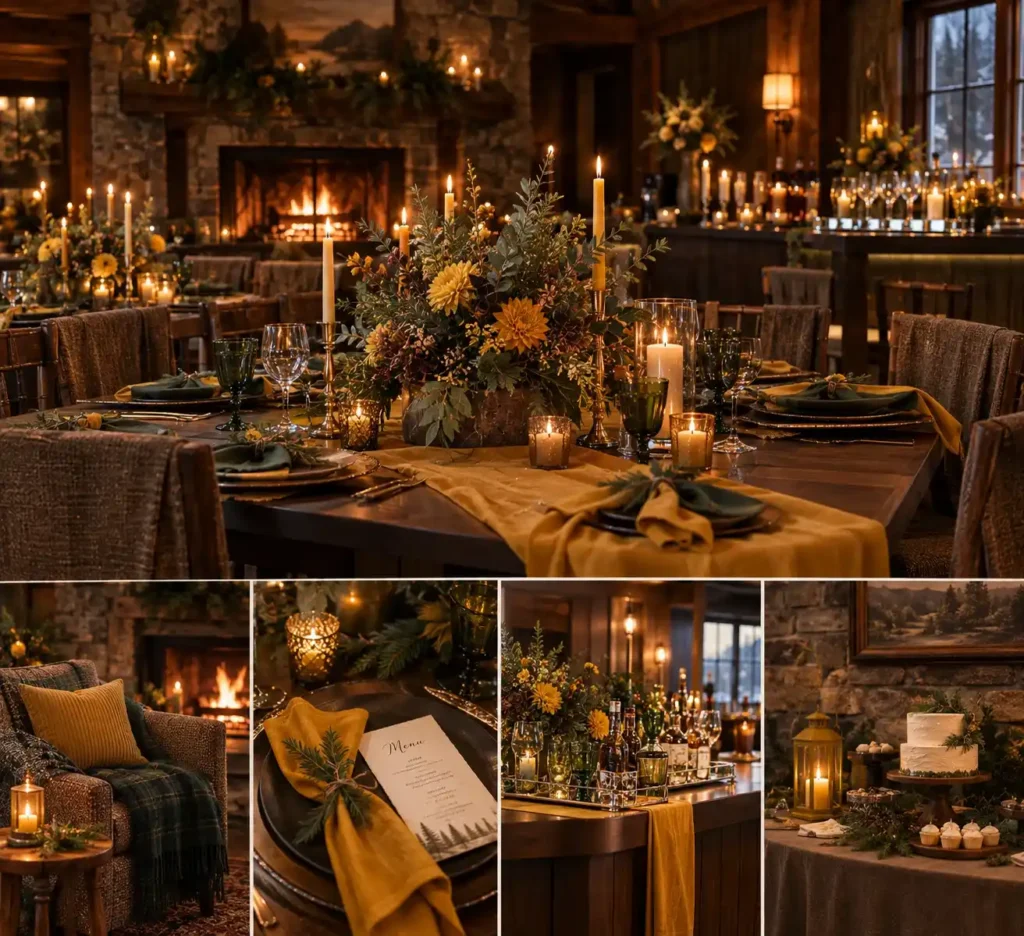
A stone‑walled cabin with dark pine paneling and a roaring fireplace sets the stage for the mustard‑yellow, forest‑green, and tweed‑brown palette.
The look leans on heavy textures: tweed chair covers, corduroy lounge pillows, and dark wood tables.
Mustard yellow becomes the light‑reflecting hero, so use it on a wide runner, large napkins, or a bold floral centerpiece.
Forest‑green accents appear in glass vases, pine boughs, or bridesmaid dresses. Tweed brown ties the room together through sashed chairs and table skirts.
The combination thrives in mountain lodges and wood‑heavy venues that already feel enclosed.
If the beams are deep walnut, let the mustard run the color story; otherwise the space can sink into a cave‑like mood.
A quick tip: line the bar with mirrored trays to bounce the yellow light across the room.
This scheme suits intimate weddings of 50‑80 guests who enjoy a rustic, outdoorsy vibe.
Couples who love vintage cabins will find the textures comfortable and cohesive. For a budget‑friendly spin, swap silk runners for mustard‑dyed kraft paper ribbons.
Add a single mustard‑yellow lantern on the dessert table to pull the whole room into the light.
9. Espresso, Champagne, and Ivory

Monochromatic champagne exudes quiet luxury, yet synthetic satin versions turn yellow and cheap under indoor lighting, so opting for matte crepe or velvet is wiser.
Pair the deep espresso velvet of a table runner with ivory lace napkins; the contrast anchors the palette without overwhelming it.
Use champagne only on candleholders, glassware, and a few brushed‑gold accents to keep the hue from dominating the scene.
Bridesmaid dresses in heavy crepe drape beautifully and stay true to the muted sheen, while a velvet slip dress adds depth for the mother‑of‑the‑bride.
A quick tip: line the backs of chairs with ivory silk organza to catch the candlelight and reinforce the neutral theme.
If the satin look feels unavoidable, rent a set of crepe gowns instead of buying; rental costs hover around $120‑$180 per dress, whereas custom crepe can run $250‑$350.
For couples who prefer a cooler vibe, swap champagne for soft pewter and keep espresso and ivory unchanged.
Quiet‑luxury neutrals are a top trend for 2024 winter weddings, though designers predict a shift toward deeper jewel tones next season.
Finish the tablescape with a single copper‑tinged place‑card holder to introduce subtle warmth without breaking the monochrome feel.
10. Deep Teal, Gold, and Mustard
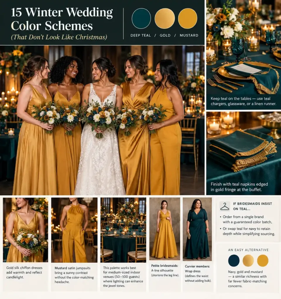
Matching teal bridesmaid dresses across different apparel brands often results in visible dye‑lot mismatches.
Deep teal flatters a wide range of skin tones, so it remains a strong visual anchor for the celebration.
To avoid clashing, keep teal on the tables, use teal chargers, glassware, or a linen runner, while dressing the bridal party in gold or mustard gowns.
Gold silk chiffon dresses add warmth and reflect candlelight, and mustard satin jumpsuits bring a sunny contrast without the color‑matching headache.
This palette works best for medium‑sized indoor venues (50‑100 guests) where lighting can enhance the jewel tones.
For petite bridesmaids, choose an A‑line silhouette that shortens the leg line; curvier members may prefer a wrap dress that defines the waist without adding bulk.
If the bridal party insists on teal, limit the dress order to a single brand that offers a guaranteed color batch, or swap teal for navy to retain depth while simplifying sourcing.
An easy alternative for couples who shy away from teal entirely is navy, gold, and mustard, a similar richness with far fewer fabric‑matching concerns.
Finish the look by adding teal napkins edged in gold fringe to the buffet; the pop of teal stays cohesive without risking dress inconsistencies.
11. Winter Berry, Cranberry, and Frosted Eucalyptus
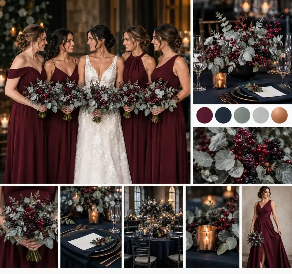
Swap bright pine garlands for misted eucalyptus stems brushed with a light silver spray.
Pair the frosted greenery with deep burgundy berries; think fresh cranberry clusters or frozen‑tinted blackberry sprigs.
The muted green tones keep the look wintry, while the dark berries give the traditional red a sophisticated edge.
Choose matte navy or charcoal table linens; the dark base anchors the colors and prevents the scene from slipping into holiday cheer.
Avoid red plaid ribbons and pinecone scatters; those items instantly signal a Christmas setting. Even a single rustic element can derail the refined palette.
Quick tip: arrange the berries in matte black metal bowls and nest the bowls among the eucalyptus. The contrast highlights the berries without adding extra color.
Add a single copper candle holder on each table to introduce subtle warmth while keeping the overall scheme sleek.
12. Midnight Blue, Silver, and Ice Blue
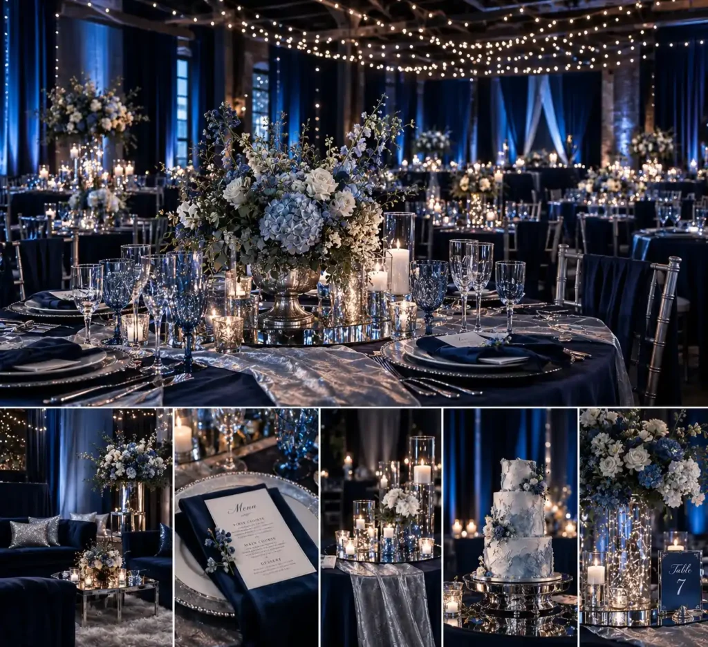
A dimly lit industrial loft draped in midnight‑blue curtains and strung with twinkling fairy lights creates the backdrop for this scheme.
The deep navy sets a night‑sky tone, while ice‑blue glassware adds a cool sparkle and brushed‑silver table runners reflect the light.
This palette thrives in venues that already have low ambient light, because the fairy lights become the main source of illumination.
The look relies on immersive lighting design and extensive silver drapery, which can drastically increase your production and rental bills.
For a splurge version, rent full‑length silver velvet drapes and a programmable LED wash that shifts from navy to icy teal.
On a tighter budget, replace the velvet with matte silver organza and use battery‑operated string lights wrapped around clear acrylic vases.
Quick tip: anchor the fairy lights to the ceiling with thin fishing line so they appear to float, then dim the overhead bulbs to let the strings become the focal point.
A common mistake is over‑lighting the space, which washes out the midnight hue and makes the silver look cheap. Keep the overall wattage low and let the navy absorb the excess glow.
Add a few mirrored cocktail trays on each table; they bounce the soft light and give the illusion of more silver without the rental cost.
13. Mauve, Amethyst, and Slate
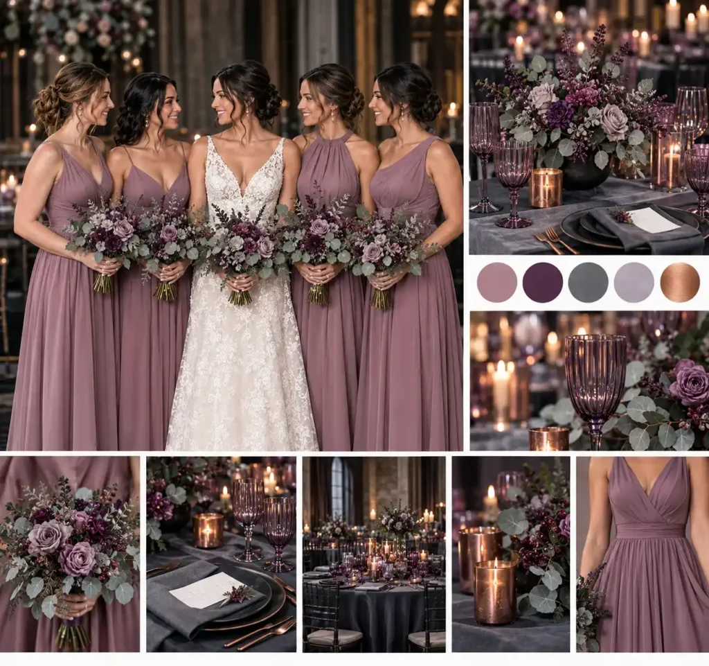
A matte amethyst glassware set catches the low winter light and adds a cool sparkle to the table. Pair it with slate‑grey linen runners and napkins for a grounded backdrop.
The mauve bridesmaid dresses sit between the two, giving the palette a dusty, sophisticated feel.
Because bright purple can feel childish, the muted tones keep the look mature and winter‑appropriate.
Check the mauve fabric under natural daylight before ordering. In cloudy weather, the color can flatten to a lifeless grey, especially under dim reception bulbs.
A quick tip: bring a small swatch to the venue at dusk and view it next to the slate linens; the contrast will reveal any unwanted dullness.
If the hue leans too grey, swap the dress for a slightly deeper lavender or add a subtle silver belt to lift the shade.
Finish the tablescape with brushed‑copper candle holders. The metal reflects the amethyst glass without overwhelming the slate, and the soft glow highlights the mauve without turning it gray.
14. Caramel, Toffee, and Vanilla
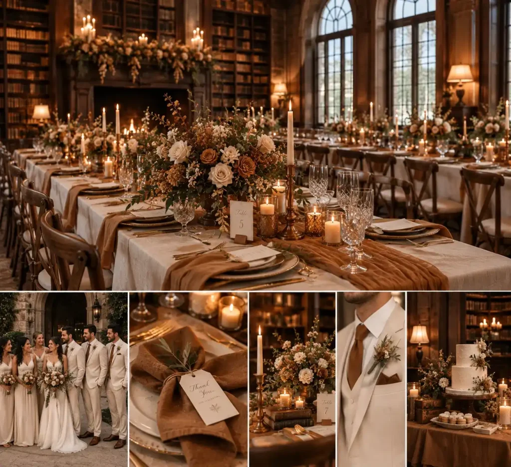
A historic library with dark oak stacks and tall arched windows frames the caramel, toffee, and vanilla palette perfectly.
The warm baking‑spice tones echo the aged leather books and soft amber lighting, while an industrial loft with exposed brick and steel beams can carry the same vibe through raw textures.
Use caramel for table runners, toffee for napkins, and vanilla linen for place settings; the palette feels inviting without slipping into holiday red.
Because caramel and beige can severely wash out fair skin tones, keep the bridal party in vanilla or off‑white gowns and suits.
Save the deeper caramel for groomsmen ties, cocktail dresses, or decorative accents like candlesticks.
Choose gowns with a fitted bodice and a slight flare to balance the soft hues; ensure ties are the standard 3‑inch width for a clean look.
If the primary bridal party has light complexions, swap a caramel accent for a deep plum or navy pocket square to maintain contrast.
A common mistake is dressing the bride in a caramel dress, which can blend into the background. A budget‑friendly option is a thrift‑store caramel table runner paired with new ivory chargers.
Add a caramel‑hued copper candlestick to each table for a subtle pop.
15. Claret, Hunter Green, and Antique Brass
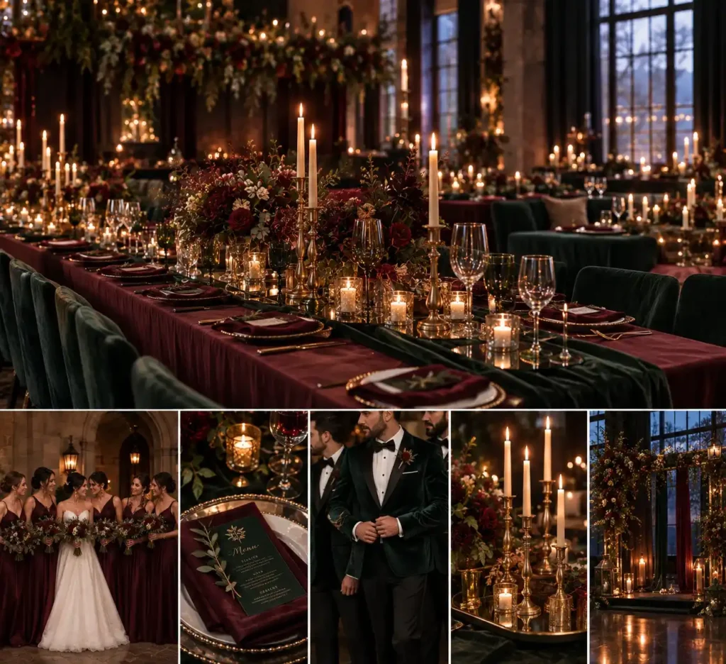
A deep claret drape on the bridesmaids’ gowns meets hunter‑green velvet dinner jackets, while antique brass candlesticks catch the flicker of candlelight.
The dark fabrics create a regal feel, but without ample candlelight, the room can feel heavy and dim.
Use rows of brass candlesticks on mirrored trays to bounce light across the tables and soften the palette.
For the groom’s party, choose a tailored hunter‑green velvet tuxedo jacket with a single‑breasted cut; the rich texture stays crisp when dry‑cleaned and resists wrinkling, making it reusable for future events.
Bridesmaids in claret silk chiffon or satin A‑line gowns flatter most body types; the silhouette skims hips and elongates the torso, while the deep hue works especially well on taller guests.
A practical tip: place a small LED tealight inside each brass holder for a steady glow after the real candles melt, preserving the warm ambience for the entire reception.
Maintenance note: polish brass with a microfiber cloth and mild metal cleaner after each use; store velvet jackets in breathable garment bags to avoid mildew.
Add a strip of warm white LED rope behind the centerpiece cluster to maintain consistent illumination as the night progresses.
Pick Your Favorite Palette
We’ve walked through fifteen winter‑ready color stories, each with a quick styling cheat sheet for lighting, textiles, and metal accents.
Choose the scheme that matches your venue’s lighting and budget, then lock in fabrics and finishes early to avoid last‑minute swaps.
You now have the palette; let the details fall into place and watch your guests notice the thoughtful hue choices before they notice the temperature.
Frequently Asked Questions
How do I choose a winter wedding color scheme that does not look like Christmas?
To avoid a holiday cliché, steer clear of pairing bright cherry red with forest green and pinecones. Instead, swap bright red for deep claret, burgundy, or plum, and use dusty, muted greens like olive or eucalyptus alongside warm metallic accents like copper or antique brass.
What are the most budget-friendly winter wedding colors?
Monochromatic neutrals like charcoal, cream, and pewter are highly budget-friendly because they require minimal floral arrangements. You can rely on abundant candle setups, textured linens, and dried elements rather than expensive imported out-of-season flowers.
How does winter venue lighting impact my color palette choices?
Because winter days are short and receptions rely heavily on indoor lighting, dark colors like navy, black, and deep plum will absorb light and make a room look smaller. Balance these deep tones with metallics, white taper candles, and warm uplighting to bounce light back into the space.
What is the best way to coordinate bridesmaid dresses with a winter palette?
Opt for rich, heavy fabrics like velvet or thick crepe in your primary anchor color (like emerald, navy, or slate). If using warm neutrals like caramel or champagne, ensure the shade has enough contrast against your bridesmaids’ natural skin tones so they do not look washed out in photos.