
Fall Wedding Colors: 11 Real-Life Palettes That Actually Work
Fall Wedding Colors: 11 Real-Life Palettes That Actually Work
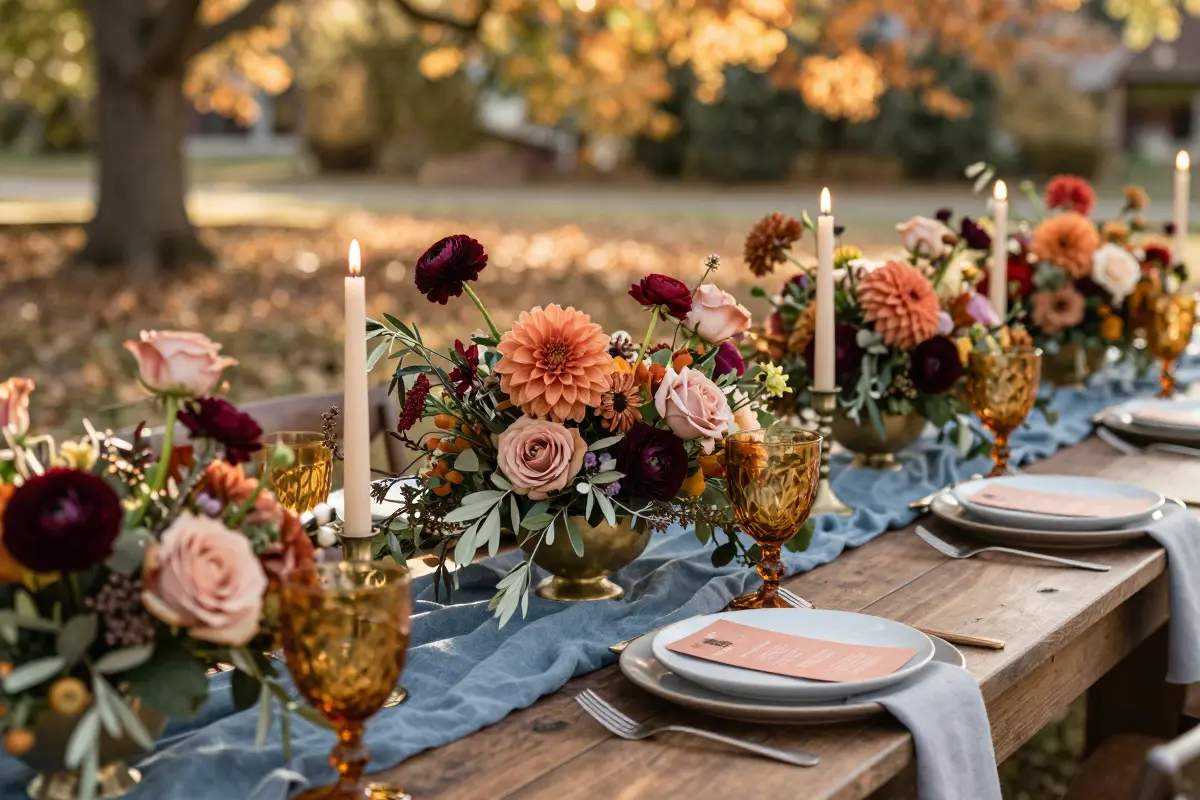
The first time I saw rust‑toned table runners paired with slate‑blue linen, I knew the usual burgundy‑gold combo was missing the mark for a true fall wedding. If you’ve been scrolling through endless Pinterest boards only to feel overwhelmed by clashing hues, you’re not alone.
In this guide, I break down twelve real‑life color pairings, from rust & slate blue to marigold & mauve, showing how each works in fabrics, florals, and décor, plus budget‑friendly swaps.
Olive Green & Warm Brass: Organic Elegance
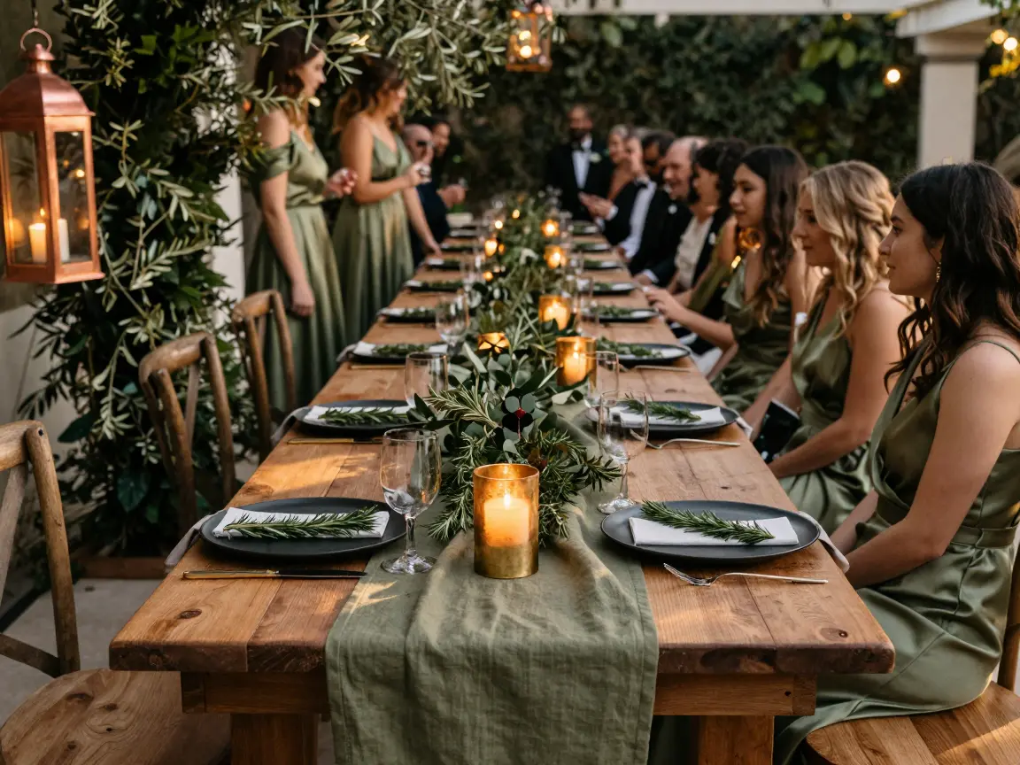
A long oak table draped in olive‑green linen sets the tone for an organic‑elegant fall wedding. Olive silk bridesmaid gowns glide past dark‑green foliage, giving a rich, neutral backdrop that flatters medium‑to‑tall figures.
Real brass candlesticks, rented for $200‑$400, add a warm glow; cheap gold spray paint on centerpieces looks harsh under warm reception lighting.
For a small gathering of 20‑30 guests, line a single banquet table with simple olive branches and a trio of brushed‑brass candle holders. If transport is a concern, swap heavy candlesticks for copper lanterns with amber bulbs.
- warm palette
- natural foliage
- heavy rentals
- cheap spray looks fake
Choose brushed brass to soften glare
Place each brass holder on a matte tray to keep reflections soft and add a sprig of rosemary to every place setting.
Burgundy & Dusty Rose: The Soft Berry Gradient
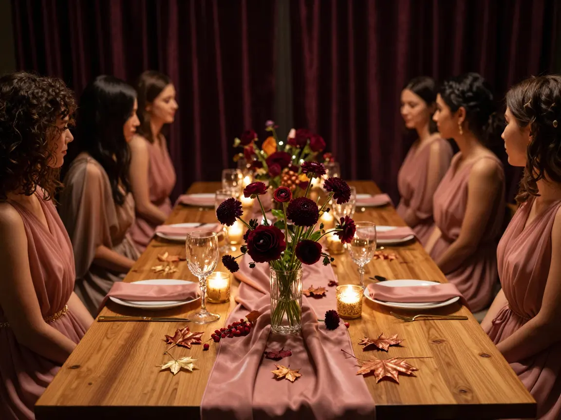
When a fall wedding is booked in a dimly lit hall, the deep burgundy can swallow the light and make the whole scene feel muddy. Pair it with dusty rose, which lifts the mood without turning the palette into a spring pastel.
Use burgundy only in focal blooms such as scabiosa or ranunculus, not in every spray; this keeps the color from overwhelming the softer rose.
- rich depth
- romantic vibe
- absorbs light, can look muddy
- needs professional uplighting
Dusty rose should dominate the table runners and bridesmaid dresses, letting the burgundy accents pop.
In dark venues, burgundy may disappear in photos without uplighting
Add a single warm uplight behind the head table to bounce light off the burgundy flowers, ensuring they stay visible in photos.
Mustard Yellow & Charcoal: Urban Autumn Contrast
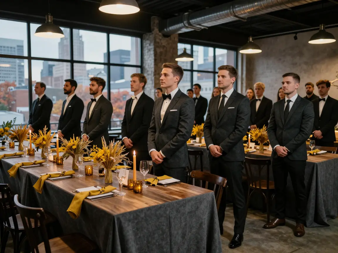
Charcoal suits dominate the visual field while mustard yellow appears only in small accents.
Use charcoal for the groom’s suit, groomsmen jackets, and tablecloths; keep mustard to dried grasses, narrow ribbons, and taper candles placed at every other setting.
This ratio stays under the 15 % threshold that prevents the yellow from turning aggressive.
The look works best for an indoor loft wedding of 30‑70 guests, where the sleek silhouette flatters athletic or rectangular body types.
For a splurge, order a custom charcoal wool suit ($300‑$500); the budget route is a rental charcoal suit at $80‑$120. A quick tip: pre‑pin mustard ribbons to the napkin rings so the accent stays even.
- modern contrast
- cost-effective rentals
- aggressive if >15%
- neon looks off‑tone
Terracotta & Sage: Dusty Earth Tones

Terracotta brick arches frame a sage-green canopy, casting a muted glow over the ceremony.
Bright sun reflects orange undertones onto skin, so choose matte crepe bridesmaid dresses instead of high‑shine satin; the dull surface diffuses light and avoids clashing with olive or very fair complexions.
The palette works best for garden weddings of 30‑40 guests, where natural backdrops amplify the colors without feeling heavy.
For curvy brides, a terracotta wrap dress with a sage belt defines the waist and balances proportions.
If the warmth feels too strong for a winter venue, swap terracotta for muted rust while keeping sage for a softer feel.
Splurge on a custom silk suit; a budget route uses off‑the‑rack crepe dresses and reclaimed clay pots as centerpieces, which you can seal yourself or rent to save time.
- Warm, earthy vibe
- Adaptable to garden venues
- Orange undertones reflect onto skin in bright sun
- High‑shine satin clashes with certain skin tones
Terracotta dresses may clash with deep olive or very fair skin tones under direct sun
Plum & Antique Bronze: Rich Dark Romance

Drape a plum‑satin panel over a brushed‑antique bronze arch to build depth instantly. The dark plum gives a romantic weight while the bronze reflects light, keeping the scene from sinking. In a ballroom without windows, the plum can turn black, so add uplighting or a few warm spotlights.
For texture on a budget, scatter fresh dark grapes and halved plums along a simple linen runner; the fruit adds organic shine for under $15.
If you splurge, a custom‑embroidered bronze‑thread runner runs $800 to $1,200; a DIY spray‑painted burlap runner stays under $50.
The bronze runner can be gently wiped and stored for future weddings, making it a reusable investment.
The fruit garnish is compostable, so cleanup stays eco‑friendly. Hiring a lighting designer is safer than hoping natural light will cooperate.
- deep romance
- metallic accent
- needs strong lighting
- can look muddy
Scatter fresh dark grapes and halved plums on the runner for cheap texture
Copper & Emerald Green: Textured Jewel Tones
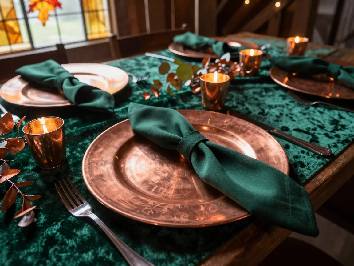
A copper‑plated charger glints against a deep emerald velvet runner, anchoring the table in jewel‑toned drama.
Emerald green anchors the look; copper reflects light and adds warmth. Use an emerald velvet runner or ribbons for texture; the fabric feels rich but can be suffocatingly warm outdoors in early fall.
Budget‑friendly option: rent copper charger plates. Splurge: hand‑forged copper set with a custom silk‑velvet runner. Avoid bright fake moss; it looks tacky up close.
Pumpkin & Navy Blue: Balanced High-Contrast

Too much pumpkin orange can turn a fall wedding into a Halloween costume party. Navy blue steadies the bright hue, keeping the mood sophisticated rather than kitschy. Aim for roughly 70 % navy in walls, drapery, or suiting, 15 % pumpkin in florals, ribbons, or table accents, and the remaining 15 % warm cream for linens and tableware.
A practical tip: choose a navy velvet backdrop for the ceremony arch and sprinkle pumpkin‑colored dried gourds among cream‑draped tables for controlled pops of color. This ratio prevents the orange from overwhelming the space and lets the navy dominate without feeling heavy.
- navy grounds palette
- high‑contrast looks elegant
- overusing pumpkin cheapens aesthetic
- navy dominance can feel too dark if not balanced
Avoid plastic pumpkin decorations; they look cheap and clash with the luxe feel.
Taupe & Warm Apricot: Muted Minimalist Autumn
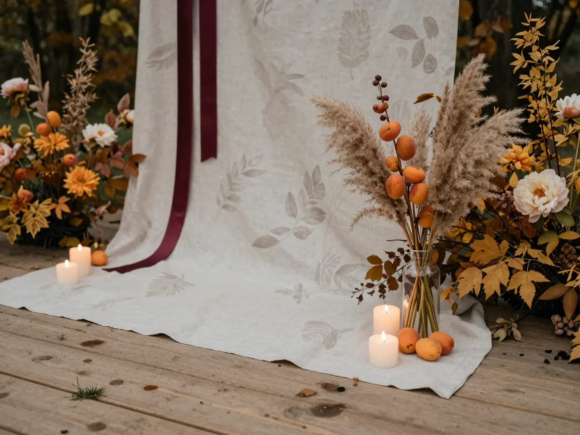
A taupe table runner rests beside warm apricot candles, the glow softening the neutral backdrop. Apricot adds just enough color to keep taupe from looking washed out. Light taupe linens betray every speck of grass, wine, or dirt on an outdoor floor.
A linen‑woven runner hides imperfections while staying breathable. For a budget bouquet, bundle dried apricot stems with pampas grass instead of fresh peonies. If muted neutrals aren’t your style, swap to broad burgundy accents.
Linen can be spot‑cleaned and reused, making the look sustainable. A splurge option is custom‑printed silk drapes and fresh apricot peonies from a florist. This palette works best in September‑October when foliage is already muted.
- warm depth
- easy pairing
- shows dirt
- needs careful cleaning
Cranberry & Forest Green: Late-Autumn Transition

A reclaimed barn door backdrop in gray anchors the ceremony. Pair a cranberry runner with forest‑green eucalyptus garlands. Choose matte green ceramic chargers, not gold, for an earthy feel.
Use a muted wine‑red cranberry, not glossy cherry. Swap pine for feathery ferns. Straying slightly too bright on the red or using evergreen foliage will instantly transform a sophisticated autumn wedding into a Christmas party.
This palette works for a medium indoor wedding of 80‑120 guests, especially on a bride in an A‑line dress that balances bold hues. Tip: stagger foliage at varied heights for depth without clutter.
- elegant autumn vibe
- rich color contrast
- Christmas feel if too bright
- pine greenery looks seasonal
bright cherry red or pine branches will shift the mood to holiday
Chocolate Brown & Soft Peach: Earthy Pastel Contrast
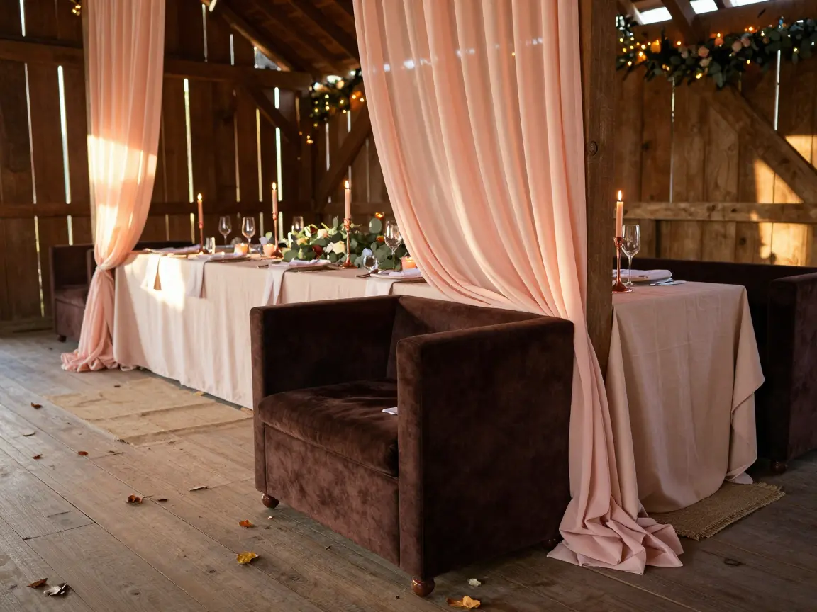
Chocolate brown offers the depth of black while soft peach supplies the glow of ivory, creating an earthy pastel contrast. The brown works as a rich, grounding neutral that feels more inviting than grey, and peach adds a gentle warmth that brightens the palette.
In a rustic barn, pair a chocolate velvet lounge chair with peach linen drapes to add texture and avoid the flat, muddy look of plain cotton.
The combination flatters most body types when the brown is worn on the lower half to elongate the silhouette. Ideal for an intimate autumn wedding of 50‑80 guests.
- Rich neutral
- Flat brown fabrics can look drab
Use a chocolate velvet runner with peach napkins
Add a copper candlestick at each place.
Marigold & Mauve: Bohemian Sunset Vibes

Layer a marigold silk scarf over a mauve linen dress to showcase the dusty sunset contrast.
The golden hue of marigold supplies warm light that anchors the cool, muted mauve. The opposite temperature creates visual balance without clashing.
- warm glow
- boho vibe
- mauve often too bright
- pastel pink bias
For a late‑October ceremony, scatter dried seed pods and bundles of wild grass among the tables. Avoid neon‑bright yellows; they will overpower the soft palette.
Test the mauve fabric in midday daylight; a true dusty tone will appear gray‑purple, not pink or violet.
Buy a swatch and view it in natural light
Finish the look by tucking a rosemary sprig into each seed‑pod bundle for a subtle scent.
Pick Your Favorite Palette
After flipping through the twelve combinations, you’ve seen how rust & slate blue can calm a space, how mustard & charcoal add urban edge, and how marigold & mauve capture a boho sunset.
Pick the duo that resonates with your venue’s lighting and your personal vibe, then start sourcing the key pieces, whether that’s renting slate‑blue linens or ordering copper charger plates.
Remember, the strongest palettes balance a dominant shade with a strategic pop; avoid overloading on bright accents and let texture do the heavy lifting.
Save this list to your inspiration board, share it with anyone planning a fall wedding, and let the colors guide your design decisions with confidence.
Frequently Asked Questions
What are the most popular fall wedding colors?
The most popular fall wedding colors include rich earth tones like rust, terracotta, olive green, and mustard yellow, alongside deep jewel tones such as burgundy, plum, navy blue, and emerald green.
What are the best colors for an autumn wedding?
The best colors are those that harmonize with your venue’s natural surroundings. Earthy combinations like rust and slate blue, or olive green and warm brass, work well outdoors, while deeper hues like plum, emerald, and burgundy excel in indoor spaces.
How do you prevent a fall wedding color scheme from looking like Halloween?
To avoid a Halloween aesthetic, avoid pairing pure black with bright orange. Instead, swap black for deep navy blue or charcoal, and use a muted, earthy terracotta or rust orange rather than a saturated pumpkin shade.
Can you use pastel colors in a fall wedding palette?
Yes, but you must anchor them. Pastel shades like dusty rose, soft peach, or sage green work beautifully when paired with a heavy, grounding color such as burgundy, chocolate brown, or deep forest green.



One Comment
Comments are closed.