
9 Spring Wedding Colors That Actually Work in Real Venues
9 Spring Wedding Colors That Actually Work in Real Venues
When I first stepped into a spring garden wedding venue and saw the décor drenched in a sea of neon lilac, the colors immediately fought the soft daylight instead of complementing it.
That moment reminded me how easy it is to pick a palette that looks gorgeous on a mood board but falls flat under real lighting, overcast skies, or a historic ballroom.
In this list, I’ve gathered nine spring wedding color combinations that actually hold up in real venues, from sage green with dusty rose to mustard with dusty mauve, each paired with fabric, floral, and texture cues that keep the look sophisticated.
1. Sage Green & Dusty Rose: The Grounded Classic
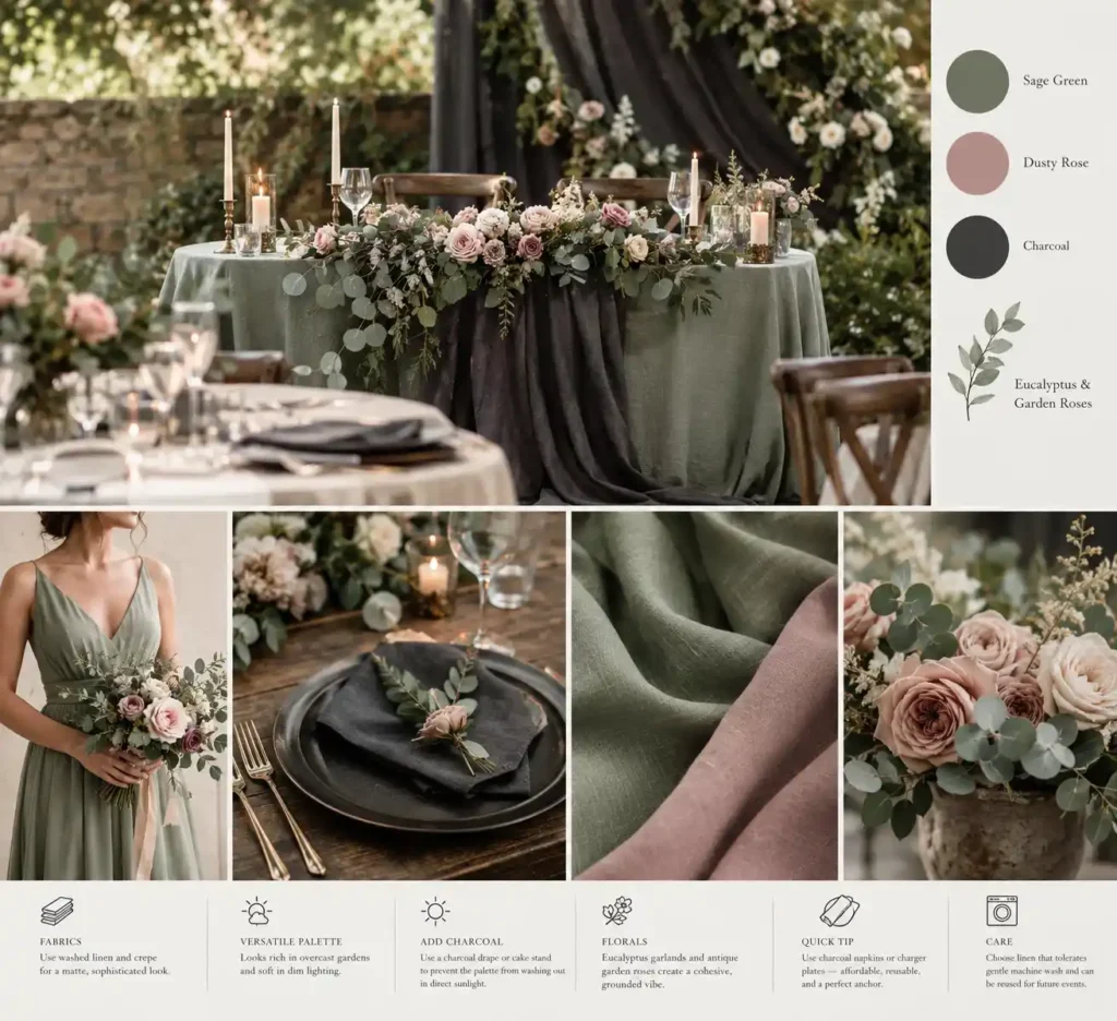
When the pink in a sage‑green and dusty‑rose scheme is too bright, the space can look like a baby’s bedroom.
Switch to muted, gray‑tinged rose and a soft sage that lean toward an earthy pastel.
Matte fabrics such as washed linen for table runners and crepe for bridesmaid dresses keep the hues from reflecting harshly, which maintains a sophisticated feel.
In an overcast garden, the colors appear rich and natural; in a dimly lit ballroom, they soften the atmosphere without needing extra lighting.
Add a charcoal accent, think a slate‑gray drape behind the head table or a deep‑tone cake stand, to prevent the palette from washing out under direct midday sun.
Pair the greens with eucalyptus garlands and antique garden roses for a cohesive floral mix that reinforces the grounded vibe.
Quick tip: use charcoal napkins or charger plates as the anchor; they are inexpensive, reusable, and pull the whole look together.
For upkeep, choose linen that tolerates gentle machine wash; it can be laundered after the event and reused for future gatherings, keeping the budget in check.
2. French Blue & Warm Buttercream: Quiet Elegance
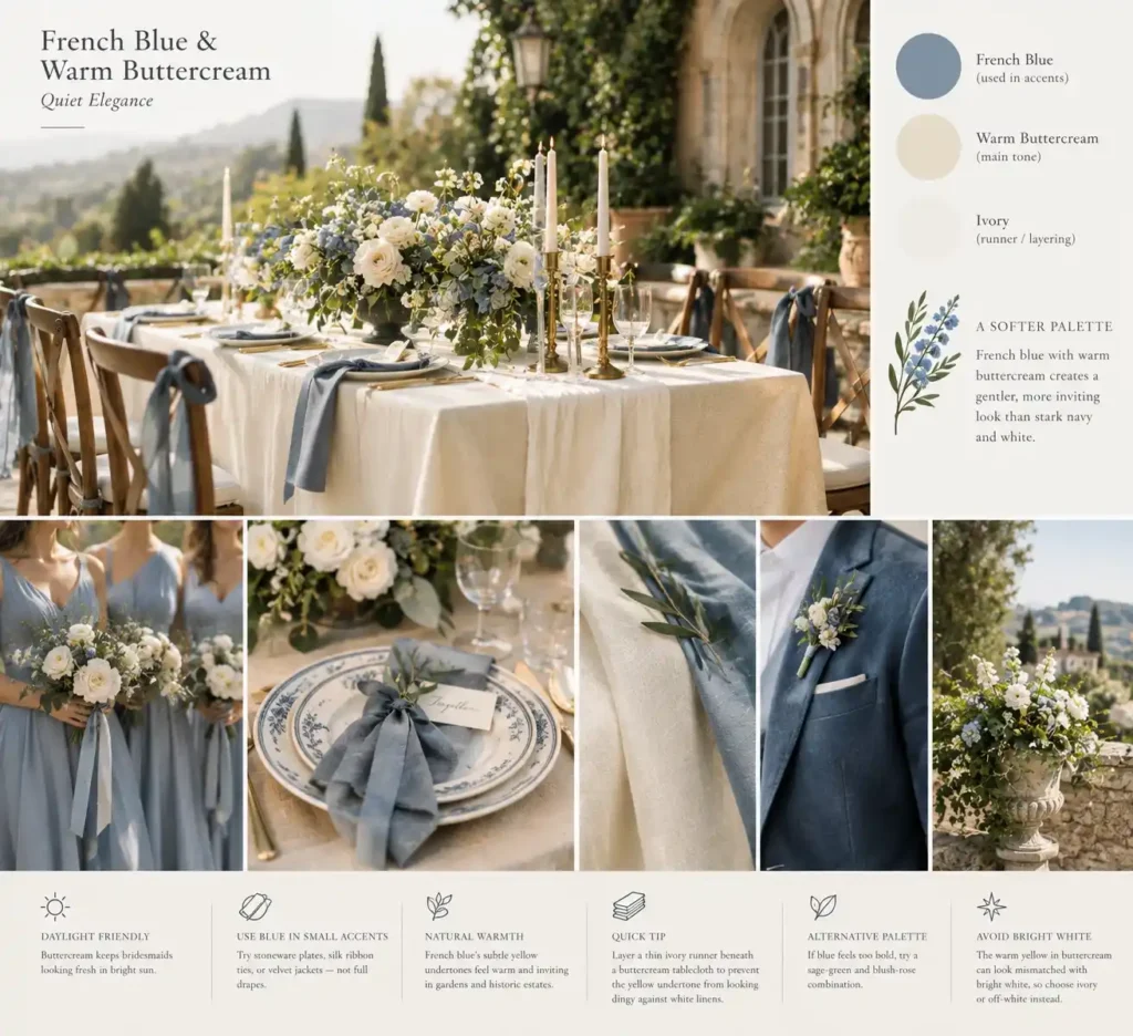
Stark navy and pure white create a harsh contrast under spring sun, while French blue softened by warm buttercream yields a gentler palette.
The buttercream hue offers a forgiving neutral that doesn’t wash out bridesmaids in bright daylight.
French blue works best on smaller accents, think stoneware plates, silk ribbon ties, or velvet suit jackets, rather than on floor‑to‑ceiling drapes that can feel cheap.
Color experts point out that French blue carries subtle yellow undertones, so it feels warm and inviting in an outdoor garden or historic estate setting.
Quick tip: layer a thin ivory runner beneath a buttercream tablecloth; the ivory prevents the yellow undertone from turning dingy against stark white linens.
If the blue feels too bold for your crowd, a sage‑green and blush‑rose combination provides a similarly soft, spring‑ready feel.
Remember, the warm yellow in buttercream can look mismatched when paired directly with bright white, so choose ivory or off‑white for a seamless look.
3. Terracotta & Pale Peach: Warm Spring Transition

On an early‑May venue where the lawn still shows patches of dry earth, terracotta and pale peach create a bridge between winter’s brown and spring’s blush.
Terracotta brings weight, while pale peach adds a soft glow that keeps the space from looking premature.
Pair the colors with raw wood slabs as table runners; the wood grounds the palette and echoes the season’s budding trees.
Use 12‑inch terracotta clay pots for centerpieces, about $5‑10 each, rather than a dozen fresh bouquets that can run $30‑50 per table.
Fill each pot with a few peach‑tinted succulents and a handful of dry grasses for texture.
A quick tip: line the pot rims with thin gold foil tape to catch the light without overwhelming the hue.
Watch the orange intensity; too many deep terracotta pieces can shift the vibe toward an autumn harvest.
Balance the tones by keeping peach ribbons and wood elements dominant. For a budget‑friendly upgrade, swap a few large pots for smaller recycled glass jars painted in muted peach.
Add a single sprig of dried lavender to each pot for a subtle scent and a hint of spring green.
4. Lavender & Cool Slate Gray: Modern and Architectural

A warehouse loft with exposed concrete beams and high‑ceiling ducts sets the stage for lavender and cool slate gray.
Slate gray linens cover each table, creating a solid visual anchor that balances the lightness of lavender.
Pair the gray with narrow lavender ribbons tied around glassware stems; the narrow width keeps the delicate stems from bearing weight and avoids costly off‑season imports.
The cool lavender hue sits opposite the deep gray on the color wheel, adding depth without feeling sweet.
Use the lavender sparingly: single sprigs in clear vases, lavender‑inked place cards, and a lavender‑tinted cocktail garnish.
This restraint lets the gray dominate, which is ideal for industrial galleries where heavy floral arrangements would clash with steel fixtures.
The look works best for modern‑minded couples hosting 40‑80 guests who appreciate a sleek, architectural vibe.
For a splurge, commission custom slate‑gray velvet drapes and order fresh lavender from a specialty farm; for a budget version, choose gray kraft tablecloths and lavender‑colored paper napkins sourced from a bulk party supplier.
Quick tip: spray a light mist of lavender essential oil on gray linen runners; the scent adds the purple note without extra stems.
Add a single lavender‑tinted candle on each table to reinforce the accent color without increasing floral volume.
5. Marigold & Olive Green: High-Energy Earthy Tones
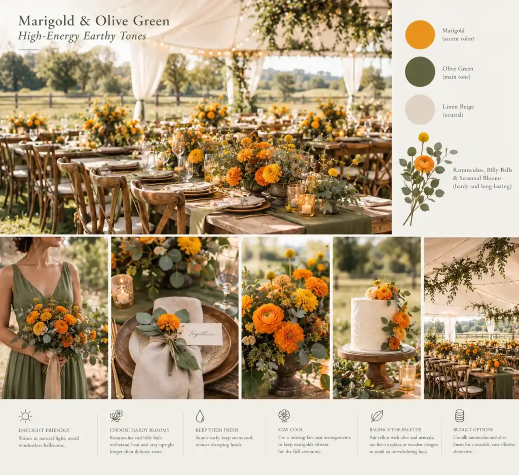
A sun‑lit farm field with a white‑tent canopy sets the stage for marigold and olive green.
The olive hue softens the bright pop of marigold, creating an organic vibe that feels natural rather than jarring.
Choose hardy blooms such as ranunculus and billy balls; they hold color in unexpected spring heatwaves and stay upright longer than delicate roses.
This palette shines at medium‑sized outdoor weddings where guests mingle on grass or under a marquee, and it flatters curvier bridal parties because the earthy backdrop drapes gracefully around fuller silhouettes.
Fresh marigolds can wilt fast, so source them early in the morning, keep stems in cool water, and swap any drooping heads after the ceremony.
For a budget‑friendly twist, substitute silk ranunculus in the same shades and tuck them into olive‑colored linen runners, still vivid, but reusable for future events.
Avoid this combination in windowless ballrooms; warm fluorescent lighting turns the yellow muddy and the green harsh, limiting its success to venues with natural light.
A common mistake is pairing too many yellow accents with white tablecloths, which can overwhelm the eye; balance with neutral napkins or wooden chargers.
Place a small misting fan near the floral arrangements to keep the marigolds vibrant through a five‑hour ceremony.
6. Lilac & Pale Pistachio: Playful and Botanical

Layer a pistachio linen table runner under a lilac silk napkin to create depth.
Start with a full‑width pistachio tablecloth; it sets the 60 % green canvas and blends with viburnum and spirea foliage.
Add clusters of fresh pistachio foliage around the perimeter, leaving room for tall lilac taper candles that occupy roughly 30 % of the visual field.
Position the candles in glass votives to keep the lilac hue vivid without overwhelming the green.
True lilac blossoms are incredibly delicate, wilt almost immediately once cut without a water source, and can be exceptionally pricey during limited spring weeks.
If fresh lilac is out of budget or unavailable, substitute with silk lilac blooms or dyed eucalyptus stems; they hold color longer and cost a fraction of fresh flowers.
Quick tip: attach a thin ribbon of lilac organza to each pistachio foliage bundle; the ribbon catches light and reinforces the accent ratio without extra floral spend.
A splurge version uses hand‑picked lilac buds from a local farm, while a budget version mixes dried lilac petals into the centerpiece sand.
Finish the look by tucking a single rosemary sprig into each vase for scent and an extra pop of green that stays fresh all day.
7. Washed Teal & Sandy Beige: The Coastal Spring Palette

Unlike the classic navy‑and‑white scheme that can feel formal and stark on a pier, washed teal with sandy beige reads as breezy and relaxed.
The muted teal mirrors the sea’s distant hue, while the warm beige mimics drift‑washed sand, creating a coastal feel without slipping into a tropical beach vibe.
Pair raw silk table runners in a soft ivory with the teal accents; the sheen adds depth that counters the palette’s cool undertone on gray, windy mornings.
Replace typical seashell centerpieces with sea‑glass votive holders and bleached linen napkins for texture that feels natural yet polished.
This combination shines at intimate waterfront ceremonies of 50‑80 guests, especially for brides with a curvy silhouette who benefit from the teal’s vertical pull and the beige’s grounding effect.
If teal feels too bold, a muted sage paired with ivory offers a similarly soft coastal look.
A common mistake is loading the space with nautical trinkets; they distract from the refined color story. To keep costs down, dye kraft paper runners teal with natural indigo and layer them under a simple burlap runner.
Add copper‑wire‑wrapped driftwood place cards for a warm, tactile finish that lifts the teal on overcast days.
8. Apricot & Soft Mint: High-Contrast Pastel

Mint can wash out cool or pale complexions, leaving bridesmaids looking faded.
Pair it with apricot, whose orange undertone flatters warm skin tones, and the contrast stays lively without overwhelming guests.
Use apricot for dresses or jumpsuits; an A‑line cut in a lightweight crepe works for most body shapes and avoids clingy seams.
Keep mint off apparel and instead drape mint‑green linen runners across the tables and cluster eucalyptus‑mint foliage in the centerpieces.
This placement lets the color pop without demanding a perfect match to every guest’s skin. Ground the bright palette with clean brass or brushed‑gold hardware; think napkin rings, flatware, and a single gold candle holder per table.
A quick tip: choose a mint runner that’s at least 14 inches wide; narrower strips can look like a garnish rather than a backdrop.
Avoid the mistake of scattering tiny mint sprigs among candles; they can look like stray herbs and dilute the effect.
Finish each setting with a brushed‑gold charger under the plate to anchor the colors and keep the look polished.
9. Mustard & Dusty Mauve: The Moody Vintage Duo
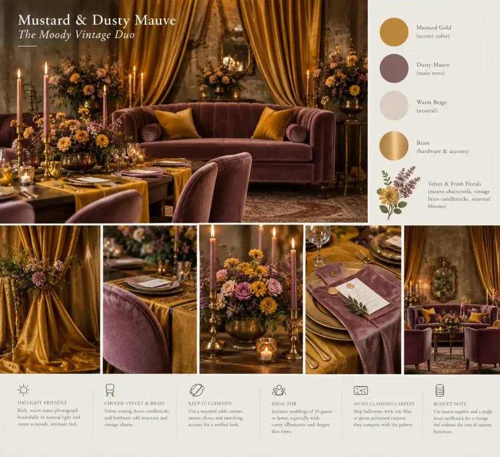
A mustard‑gold satin drape frames a dusty‑mauve velvet sofa, the two shades pulling opposite ends of the room’s mood.
The warm mustard cuts through the muted mauve, creating a striking contrast that reads clearly on camera.
Pair the duo with vintage brass candlesticks; the warm metal echoes the mustard while the brass patina adds a retro polish.
Add a few velvet‑covered chairs in mauve and a mustard table runner for a cohesive look.
This palette shines in intimate weddings of 50 guests or fewer, especially when the couple has a curvy silhouette that benefits from the structured lines of brass and the soft drape of velvet.
The rich tones flatter deeper skin tones and give the ceremony a moody, vintage vibe.
Avoid ballrooms with heavily patterned red, blue, or green carpets; those colors will clash hard with mustard and mauve, pulling the eye away from the décor.
A practical tip: choose matte‑finished mustard linens to keep the contrast bold without unwanted shine under soft lighting.
On a tighter budget, replace full velvet upholstery with mauve napkins and a single brass candlestick, still delivering the vintage feel without the cost of custom furniture.
How to Balance Your Wedding Colors: The 60-30-10 Rule
Lay out 60 % of the palette on the main linens, 30 % on secondary elements like florals, and 10 % on accents such as candles or metal charger plates.
Start by choosing a dominant neutral, ivory, soft gray, or muted taupe, and cover the ceremony and reception tables with that color.
Next, pick one of your spring hues (for example, sage green) and apply it to the bridal party dresses, bouquet stems, and centerpiece foliage.
Finally, sprinkle the accent hue (like brushed gold) into candle holders, napkin rings, and glassware rims.
The formula prevents the eye from hopping between too many equal blocks of color, a mistake that makes the space feel chaotic.
Keep the dominant color at least three times larger than the accent; otherwise the visual hierarchy collapses.
A quick tip: create a simple digital mood board with the three percentages before ordering fabric or décor, so you can see the balance at a glance.
Remember, the rule is a guide, not a cage. Over‑analyzing can freeze the room into a staged tableau instead of a welcoming celebration.
To stay flexible, add a single gold napkin ring per place setting; it hits the 10 % accent target without overwhelming the overall look.
Your Next Palette Pick
We’ve walked through each of the nine pairings, highlighted the right fabrics, floral choices, and the 60‑30‑10 rule to keep the visual flow clean.
The guide also flags common pitfalls, like over‑saturating terracotta or using bright pink in dim interiors, so you can avoid a mismatched color disaster.
Pick the palette that mirrors your venue’s natural backdrop, order a few swatches, and test them in the actual lighting before finalizing.
You now have the tools to create a cohesive, memorable setting that photographs beautifully. Save this guide for your next color board session and share it with any fellow bride‑to‑be wrestling with spring hues.
Frequently Asked Questions
What are springtime wedding colors?
Springtime wedding colors are traditionally soft, light, and airy tones like sage green, dusty rose, French blue, and pale peach. However, modern spring palettes often incorporate muddier, grounded undertones like terracotta, olive, and slate gray to prevent the design from looking overly childish or washed out.
What are the trendy colors for weddings in spring?
The trend is shifting away from bright, hyper-saturated pastels toward more organic, earthy color combinations. Popular choices include warm buttercreams paired with soft blues, mustard yellow offset by dusty mauve, and sage greens anchored by natural wood and neutral stone tones.
How do you choose a spring wedding color scheme that doesn’t look like Easter?
To avoid an Easter egg aesthetic, avoid using only bright pastels in equal proportions. Ground your palette by introducing a muddy, desaturated neutral like charcoal, warm taupe, or olive green, and apply the colors in varying percentages rather than a 50/50 split.
How do spring wedding colors impact your floral budget?
Choosing colors that naturally match in-season spring blooms like tulips, ranunculus, sweet peas, and lilacs will dramatically lower your floral costs. If you select out-of-season colors that require importing exotic flowers, your floral budget will spike due to shipping and greenhouse cultivation fees.